 I recently had the great opportunity to sit down and have a conversation with illustrator Marcellus Hall at his home in NYC. Marcellus was a teacher of mine back in my early days at School Of Visual Arts. His class offered me an insight into what an illustrator actually does and the process behind creating an editorial illustration. In class I got to see a lot of it first hand, as Marcellus would bring in assignments that he had just finished or sketches that he had sent to an art director. All of this really appealed to me and essentially that’s what made me want to pursue illustration as a career (rather than cartooning, which was my major throughout school). Just like our days in class, during my visit Marcellus was more than generous in sharing his work, both old and current. Throughout the course of our conversation we talk about his process of working on a children’s book, the role of Photoshop in illustration and his love for sketch-booking. The visit started off with Marcellus showing me some of the artwork he’s been creating for his fifth children’s book entitled, Full Moon and Star, written by Lee Bennett Hopkins:
Marcellus: I could show you the process.
Thomas: That’d be great.
Marcellus: It starts with this, a book dummy. I just slap down these drawings and staple it together. Later, the publisher adds the type and figures out how the words are going to play out on the pages. Then, I’ll bring this in and they’ll approve it or tell me what I need to change. Then, I’ll take each sketch and bring it to Kinko’s and blow it up to the size I’m going to work on. I then take a piece of vellum and trace over the rough, tightening it up, making it a little more exact. Once that’s tightened up, I use a piece of graphite paper to transfer the pencils onto the watercolor paper.
Thomas: Do you like to keep it sort of loose at this stage?
Marcellus: It’s not loose, I want to make sure things are in place. The problem is though, that I don’t have a lot of the spontaneity as a result. The spontaneity comes when the watercolor get’s splashed on.
Thomas: Same thing with my work, I feel that sometimes when I light box, it could easily allow the drawing to stiffen up and lose something in the process. When I add ink to it though, that's where the drawing starts to come alive again. Is that what the watercolors do for you?
Marcellus: Yeah, hopefully. That’s the idea at least.
%5B1%5D.jpg) Thomas:
Thomas: So once you get it onto the board, how long will a spread in the book take you?
Marcellus: It’s really important for me to put some paint on, let it dry, and as it dries I kind of circle it, go in the other room, come back and look at it again. Sometimes it’ll sit on my desk for days or weeks. There usually isn’t that kind of time with editorial work, but with a children’s book you have months to work on it.
Thomas: Do you have to re-do pages a lot when working on a children’s book?
Marcellus: Yes, but only because I make myself do the changes.
Thomas: So no one’s putting pressure on you to do a bunch of changes?
Marcellus: No, they’re more lax than I am.
Thomas: Are they much more concerned with the cover?
Marcellus: Probably, yeah. They’ll be a little more critical about that. And here’s the cover. I’m going to lay acetate on top of that and do the lettering.
Thomas: Are you considered ‘old school’ for doing lettering overlays on acetate paper?
Marcellus: Yeah, as the years go by, I’m considered more and more ‘old school’ and I’m not that old (laughter).
Thomas: I respect that process though, I think it’s really awesome. Is that a decision you make because it feels right doing it that way?
Marcellus: Yeah, it feels right. I guess what I’m saying is that I’m young enough to know how to do Photoshop and I have learned how to use it and I’ve colored things with Photoshop and it takes me just as long to color something with Photoshop as it does with watercolor, but it seems less fresh, so I like the hands on approach. So, when I get labeled ‘old school’, I hate it, but it’s worth it, I’m not going to give it up. Or sometimes they’ll say ‘retro’, but maybe that’s because I’m in love with 1930’s and 40’s drawing style, I don’t know.
 Thomas:
 For me, I’ve been trying to find a better way to integrate Photoshop with my drawing in more of a seamless way, so it doesn’t necessarily look like it was colored in Photoshop, using more hand created textures, not to make it look so computery. I look at some of the stuff I made while still in school and fresh out of school and it’s just disgusting, I was just going crazy with Photoshop, getting carried away with all the tools and relying too heavily on it for fancy affects. So, if I could keep it more about the drawing and less about the Photoshop…
Marcellus: Yeah, I think that’s good. I’ve seen people doing it, and I’ve seen stuff you’ve done and more and more people are using Photoshop to amazing effects and I love those textures that get put in there. Sometimes I look at those drawings and think ‘how the hell did they do that?’, which is cool I guess..
Thomas: Would you agree that there is that quality of brush and paper that nothing can really beat?
Marcellus: Oh yeah. It’s funny though, I remember when Photoshop first burst on the scene and all the illustrators were using it, I was frustrated because suddenly my drawings looked dirty (laughter) They didn’t look as clean.
 Thomas:
 I do all my drawing by hand so I have all my original black and white drawings, but to some extent I feel like less of an artist because if someone asked to see the original colored drawing, I would have to give them a digital print out. And that’s one of the reasons I want to use less Photoshop, but it all comes down to confidence in the execution I guess.
Marcellus: I struggle every time I set out to do coloring. It’s hit or miss, y’know, I fail and then I start again and I rack my brain, there’s blood sweat and tears and sometimes I hate the fact that I’m even doing it and I’m jealous of all the ‘Command Z’ people. (laughter) There’s an illustrator named Eric Palma and he used to do watercolor and now he does Photoshop and he does it extremely well, it looks amazing.
Thomas: To me, when I see work like yours that’s completely hand done, it makes me think that particular artist has a great sense of confidence in what they do. For myself, I guess by trying not to rely so much on the computer, I’m just trying to build up a better sense of confidence in drawing and executing an illustration. Y’know, if I was living in a tree house in the middle of the rainforest and all I had was an internet connection and I got a editorial job that needed to be in that night, I would have to use whatever I had around me in order to create an illustration, and having that kind of confidence in order to pull something like that off would be essential.
Marcellus: I totally agree with you, I think I even adopted that sort of philosophy when I was really young. Part of it had to do with music. I was really in love with folk music and people like Woody Guthrie – he didn’t need an amplifier, he’d just pick up an acoustic guitar and start strumming or even sing acapella and I appreciated that kind of raw, D.I.Y approach, it was self sufficient, I loved that. And so it carried over into my art and I thought, I don’t need fancy watercolor paper and this and that, I could draw on a scrap of cardboard that I found on the street, I could use my blood, whatever (laughter).
 Thomas:
 Your sketchbooks are awesome. One of the things I remember from your class is you bringing in your sketchbooks and openly sharing them with all of us. For me as a student, that was invaluable, being able to see those in person, it was like seeing where it all happens, no tricks, I saw the mistakes, the experiments…
Marcellus: Yeah, raw, free form kind of experimentation…
Thomas: Does that kind of tie into your D.I.Y approach?
Marcellus: Yeah, I think so. I just love the idea of sketching from life and I loved the idea of just coloring something with a tea bag. I just loved using materials at hand. Most of them are from real life, for some reason I don’t draw from my head all the time or that much, unless it’s an illustration job. The sketchbooks give me an opportunity to experiment with color and also to draw without inhibition and I also experiment a lot with composition, it helps me a lot compositionally. I remember thinking when I first started keeping a sketchbook that composition was my weakness, so for me the object was to fill a rectangle with lines that had a pleasing composition. And that sounds almost too obvious, but it really is a combination of lines that create a pleasing composition and some people forget that. You have to step back and look at it abstractly, I think
Thomas: Totally. How important is the outcome of a sketch to you? Are you thinking at all about the outcome?
Marcellus: Yeah, I am. It’s like a high wire act, I want to come out on top, I want to create a great piece and sometimes I fail. I guess the high wire metaphor is appropriate because you can fall, it’s a balancing act because I’m committing to paper with a non erasable pencil and without a net, y’know?
Thomas: I try to keep a sketchbook as much as possible, but I get frustrated with them sometimes because I feel like it becomes this art object or something, like every page in it has to be amazing. And I feel like the fancier the sketchbook is, the more pressure there is in terms of filling it up. Do you have that sort of…
Marcellus:Anxiety?
Thomas: Yeah, I mean it’s the stupidest thing, anybody that’s not an artist would think we’re crazy about having anxiety about filling this book up…
Marcellus: Yeah, for years I avoided good materials because I was too anxious. But then when I could start affording better quality materials, I was like hitting my head saying ‘why didn’t I use these materials earlier?’ because it makes such a big difference to have good paper. I remember wondering why certain watercolor wouldn’t apply to certain papers and it was because it was bad paper.
%5B1%5D.jpg) Thomas: I try and draw outside from life as much as possible, but I find it hard to not get spotted by someone who I might be drawing, or someone who wants to look over my shoulder which just makes me self conscious. But then I see your sketchbook stuff and I’m like, “fuck, I would love to do stuff like that!” What’s your method?
Thomas: I try and draw outside from life as much as possible, but I find it hard to not get spotted by someone who I might be drawing, or someone who wants to look over my shoulder which just makes me self conscious. But then I see your sketchbook stuff and I’m like, “fuck, I would love to do stuff like that!” What’s your method?
Marcellus: I think I’ve perfected some way to avoid scrutiny, I’m not sure how I do it, but I don’t get people over my shoulder that often and when I do I’m actually pretty confident and I have to say I think it’s just from years of doing it. I totally understand the self consciousness, but I’ve overcome it, I don’t know how though. One thing that I think about when I encounter a situation where I’m going to draw people is that I don’t think of it terms of “I’m going to draw people,” I think more in terms of the people and their relationship to the environment, I’m not just going to do figure studies
Thomas: I remember you bringing into class some books on artists that influenced you like Marc Chagall and…
Marcellus: George Grosz…
Thomas: Yeah, when you first started out keeping a sketchbook, were you heavily influenced by those guys and trying to emulate them? How long did it take for you to find your own voice?
Marcellus: I remember thinking that style was something that can’t be forced. People worry about it a lot, but my solution to that was just draw constantly. I figured if you were constantly drawing, you don’t have time to think about style, it just comes. I found myself gravitating to things that I’d seen and things that I liked, but in an unconscious way.
Thomas: I started keeping a sketchbook after seeing your sketchbooks in class, I was like ‘oh man, I gotta do stuff like this’…
Marcellus: oh cool…
Thomas: I remember getting a sketchbook very similar to yours and trying to sketch like you, then I realized pretty quickly that I wasn’t you and it totally wasn’t working, then throughout school I would try and emulate various other artists sketchbook styles and I feel that only over the last year or so have I finally started to find my own voice in terms sketch booking. I feel like my own voice is not really even consistent with itself yet, it’s sort of all over the place, but at least it’s me and not someone else…
Marcellus: Yeah, and I still get influenced by people all the time. Sometimes I can’t help but start an illustration thinking about another illustrator and how they would do it. But I used to copy Ralph Steadman, do something in his style, then I would do something in Al Hirschfeld’s style and to me they’re almost polar opposites, but I was equally influenced by both of them. My line is probably more like Hirschfeld’s now, but I also absorbed a lot from somebody like Ralf Steadman. In terms of sketchbooks though, when I came to New York I actually was dying to make drawings of the city and of the people in the way George Grosz did drawings of Berlin. So I adopted a more flat, angular, cubist style, I did a lot of experiments with that kind of stuff
Thomas: Almost a collage-like composition…
Marcellus: …yeah I loved that.

Thomas: Looking through your sketchbooks, you’ve sketched all over the place, some of these are in China, South America…
Marcellus: Yeah, traveling inspires me…for you too, when you’re traveling this year, it’ll be a great opportunity for you
Thomas: Yeah, I’m going to try and create as many drawings on the road as I can and at the end of it, look through it and see if there’s something I could do with them .Haven’t really figured out what just yet.
Marcellus: It’ll certainly be invaluable I think. Also, if you’re feeling hateful towards the place you’re at, you might be able to channel some of that into a drawing, draw the people the way you see them, or if you’re lonely or excited or whatever.
Thomas: Is that what sketching is to you, especially when you’re traveling? Does is become some sort of…
Marcellus: Therapy?
Thomas: Yeah.
Marcellus: Yeah, it can. It’s also like I can’t wait to capture this and show it to people, so there’s a little bit of vanity involved.
And that’s when duty called. The New Yorker emailed him to make some last minute changes on an illustration that he was working on, so he had to get back to work. It truly was a great conversation though and it was great to look through all his sketch books from over the years and get a walk through of his process. You can check out Marcellus’ amazing illustration work at his website: www.marcellushall.com.
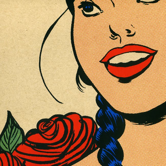
 'Jalissa' 2010
  'Jalissa' (Brown Variant)
 This bad boy(or girl, rather) measures 19" x 25" and is printed on on 100lb Poptone Sweet Tooth French paper. It is an edition of 26, so get 'em while they're hot!
 Detail shot
 Detail shot


%5B1%5D.jpg)


